Pantone’s Color of the Year 2022: Very Peri
Ready to get started?
Window World offers free in-home consultations! Click below to schedule today!
Get started!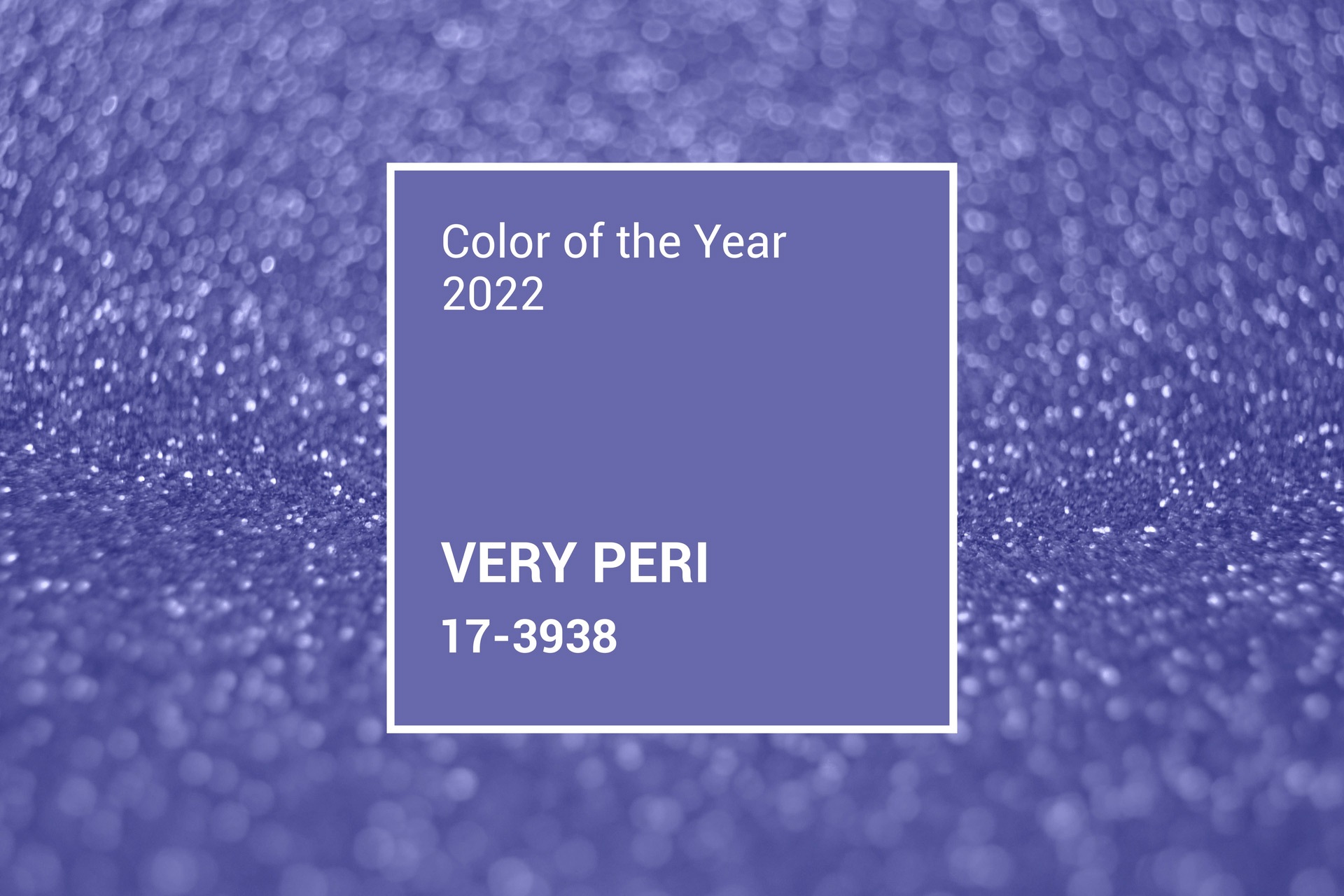
How to introduce this new hue into your home.
Each year since 2000, designers, artists, and fashionistas eagerly anticipate the Pantone Color of the Year. If you aren’t familiar with Pantone, we’ll give you a little background about who they are and why they matter to every branch of business — and your home.
In 1963, Pantone created an innovative tool that revolutionized the printing industry — the Pantone Matching System — making it possible to recreate consistent and accurate colors. This tool organizes color standards, beginning with a physical flipbook of numbered chips, and is now a digital resource.
Why is this important? Say you want to create an item in a particular shade of green. You could tell the manufacturer, “Give me a nice, soft, spring green.” However, that could be interpreted by different people — and by different eyes — in hundreds of ways. But, if you say, “Give me Pantone PMS 16-6264 TSX,” the manufacturer will know exactly how to create the perfect match.
Think of all the uses! Textiles, apparel, advertising, beauty, interior décor, architecture, and industrial design are just the beginning. More than 10,000 color standards are used in printing, textiles, plastic, pigments, and coatings. How did the world ever get along without this system?
Very Peri: Pantone creates a whole new shade for 2022

The color experts at Pantone go through a very detailed selection process when crowning their Color of the Year. They search the world for influences, including new artists, the entertainment and film industries, fashion, travel destinations, new technology, social media, and even sports. Then, they select the color that matches the mood of the world.
For 2022, Pantone did something completely new. They created a new hue.
Very Peri Pantone 17-3938 is a color that incorporates the essence of blues with a violet-red undertone — a unique and lovely periwinkle.
Says Laurie Pressman, vice president of the Pantone Color Institute, “The Pantone Color of the Year reflects what is taking place in our global culture, expressing what people are looking for that color can hope to answer. Creating a new color for the first time in the history of our Pantone Color of the Year educational color program reflects the global innovation and transformation taking place. As society continues to recognize color as a critical form of communication, and a way to express and affect ideas and emotions and engage and connect, the complexity of this new red-violet-infused blue hue highlights the expansive possibilities that lay before us.”
The experts at Pantone hope Very Peri “will display a joyous attitude that encourages courageous creativity and imaginative expression.”
We hope to see a lot of Very Peri in the future and respect its versatility and ability to uplift any setting or design.
How to work Very Peri into your lifestyle

The people at Pantone not only determine the Color of the Year, but they also show you how to incorporate it into your life with a selection of color palettes, from sophisticated and subdued to bright and playful. It’s interesting how different Very Peri feels when combined with pinks and oranges instead of greys, browns, and gold. This is a color that plays well with everyone!
So, how can you use it? From a scarf around the neck to a pocket square in a suit, Very Peri brightens any complexion. At home, it works beautifully on bedroom walls with white trim or in throw pillows, rugs, window coverings, and upholstery. And just think how pretty this could be on your bathroom cabinets!
Now let’s think big. This color could transform your home’s exterior. How about a Very Peri entry door combined with a charcoal vinyl siding color? Beautiful bold colors are all the rage in today’s home entryways and shutters. Very Peri pops beside a creamy white wall and would make a stunning ceiling color on a traditional front porch.
It seems other Colors of the Year are green with envy

Paint manufacturers like Sherwin Williams and Benjamin Moore also select their paint Color of the Year. For 2022, it seems the universal theme is green. Check out this list:
- Benjamin Moore: October Mist, inspired by the stem of a flower
- Sherwin Williams: Evergreen Fog, a Zen shade
- PPG: Olive Sprig
- Behr: Breezeway, a refreshing mint hue
- Glidden: Guacamole
- Valspar (2022 color palette): Blanched Thyme
- Farrow & Ball (2022 color palette): Breakfast Room Green
According to Sue Wadden, director of color marketing at Sherwin Williams, the consistent green theme is due to the unique lifestyle changes in 2021 that include working from home, nesting, eating outside, scenic drives, and the importance of mental health. “To me, the fact that there’s consensus like this speaks to our shared experience,” Wadden said. “It’s like no other time in history.”
In a nice coincidence, as you review the Pantone Very Peri color palette, you’ll find the palette called “Wellspring” is full of shades of green that mix beautifully with the periwinkle shade.
As you consider ways to update your home inside and out, drop by your local Window World store. We’re here with the best products to transform your home’s exterior with new entry doors, shutters, replacement windows, and siding. We’d love to discuss your ideas, including color themes, with a free consultation and quote. Find the store near you.